Power upgrade for more
POS-Performance
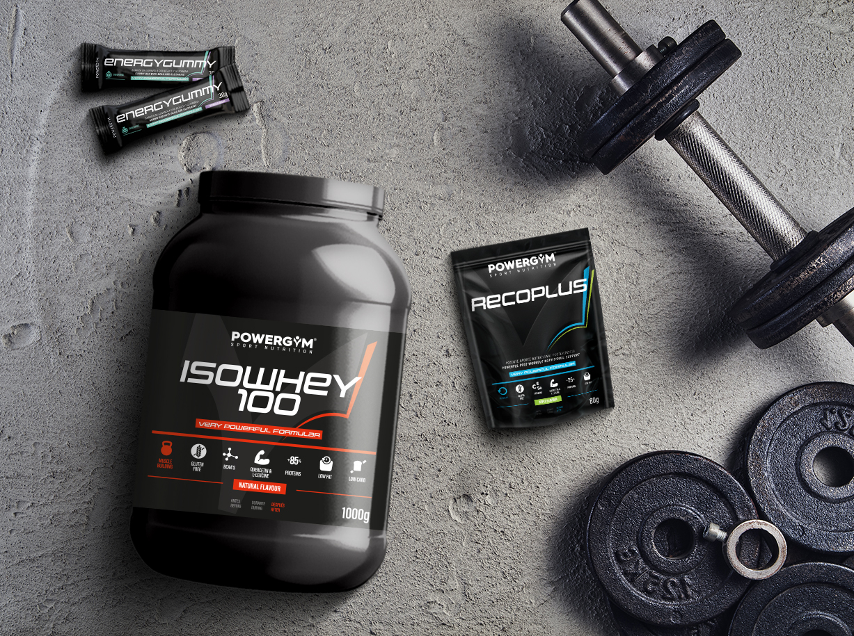
The renowned POWERGYM brand from the EVP Group has been supplying professional and amateur athletes with high-quality nutritional supplements since 1991. From powders and ampoules to protein bars – POWERGYM delivers reliably and helps consumers achieve their desired performance boost. But every now and then the brand itself needs a fresh boost.
The market for sports nutrition and food supplements is booming! This not only attracts new customers, but also many competitors. POWERGYM has to rise to this challenge – with a design that stands out from the competition in a modern and (expressive) powerful way. A brain teaser made for Melters!
Whether brand or muscle building, it all depends on the right foundation! Strong, modern and recognizable – we give the POWERGYM brand a sophisticated packaging redesign that takes it to a new level at the POS. The striking “Y” of the POWERGYM logo now forms the basis for the differentiation between the varieties: black on black, it stands as a visual anchor in the background and gives the design its premium appeal. Colored lines form along its contour on one side. These deliver two important messages at once with a lot of verve: The changing color scheme enables quick variety coding, and their appearance is reminiscent of a strong, defined silhouette. We have delivered, now the customers can get to work!
The little 1×1 of marketing: Just click and look it up!